Tuesday, 10 May 2016
Monday, 9 May 2016
Main Task Final Title Sequence
This is Our final title sequence. I have used a royalty free soundtrack and added some final shots to shape more meaning and to extend the length of the video to meet the requirements. I have composed an abrupt ending because I fell that it is quite satisfying to watch and leaving the title sequence on a cliffhanger to create suspense and tension for our thriller.
Thursday, 21 April 2016
Job Roles
Within the group we all have different job roles. Ben Llyod is our director, Sophie Tinker is our producer and Chloe Bacon is our director of photography, leaving me to take on the role of editing our main task. I felt that I would get to grips with the software slightly more to give the group more depth and opportunities while editing. Our director of photography decided to take on the role of researching our target audience and creating surveys and feedback forms to help us adapt our main task to benefit it for the better. Our producer and director were in control of researching external sources of help from directors and editors of other companies to gain professional feedback.
Editing Main Task
Editing the main task was a challenge for me as our ideas are higher in complexity compared to our preliminary task. This meant that as the editor I had to come to grips with the software and dig a little bit deeper to gain quality results.
I searched up this Adobe Premiere tutorial of how I could improve the quality of our shots. This tutorial enabled me to change the colours and tints of shots that I chose. I decided that our shots of our suspect board should have their tint changed to have an effect. I proceeded into changing all of our suspect board shots to have a light blue tint. This gave the shots of the suspect board a flashback feel and further separated them from our regular shots. This made these shots stand out and giving them a flash back effect made them appear that they were in the past and our main shots of the party scene were in the present. These establishments shaped a bit more understanding to our audience as our feedback suggested that they were a bit confused about our story.
This youtube tutorial showed me how I could lighten up dark shots through editing. I decided this would be useful to our shot of Arthur as it was dark and hard to see but on the other hand it was a really nice shot of his head movement so we didn't want to refill it if possible as we liked the shot. I managed to artificially lighten the shot to make the shot clearer to the audience. In effect, this editing technique worked really well.
This screenshot depicts that I have spaced out the shots. I have done this to synchronise the blackouts and timings with the shots with the deep soundtrack we used. This gave our title sequence a hard and rough feel to create suspense.
To further shape meaning to our title sequence. We decided that it would be a good idea to input some audio of someone speaking about a crime investigation as if the were the police. I managed to record Arthur saying some lines about an investigation. To further create the feel that the audio was spoken by the police, we thought it would be a good idea to give the audio a walkie talkie effect. I managed to do this by adding an EQ to the audio clips and altering the frequency and output. It took a lot of messing about but i managed to find the perfect frequency and output to give this effect and applied it to all three of our audio clips of Arthur speaking about an investigation. After the frequency was changed, I thought it would be a good idea to mess about with the pitch so that it sounded like someone else was speaking it like a full grown man. After messing about with the frequency for a few minutes, we found the perfect frequency that completely changed Arthurs voice and give off the impression that a police man was saying these words about a real investigation. I applied this to all three audio clips with the same statistics.
Tuesday, 19 April 2016
Main Task Third Draft
I have changed the order of the shots and titles completely and used a hard grime soundtrack and synchronised it to the title sequence to create flow and tension with black out shots. The only problem is that our video is quite short and the soundtrack is not royalty free. I will continue my research into finding a royalty free soundtrack that suits our title sequence and adding in extra shots to meet the time requirements.
Monday, 18 April 2016
Audience Feedback
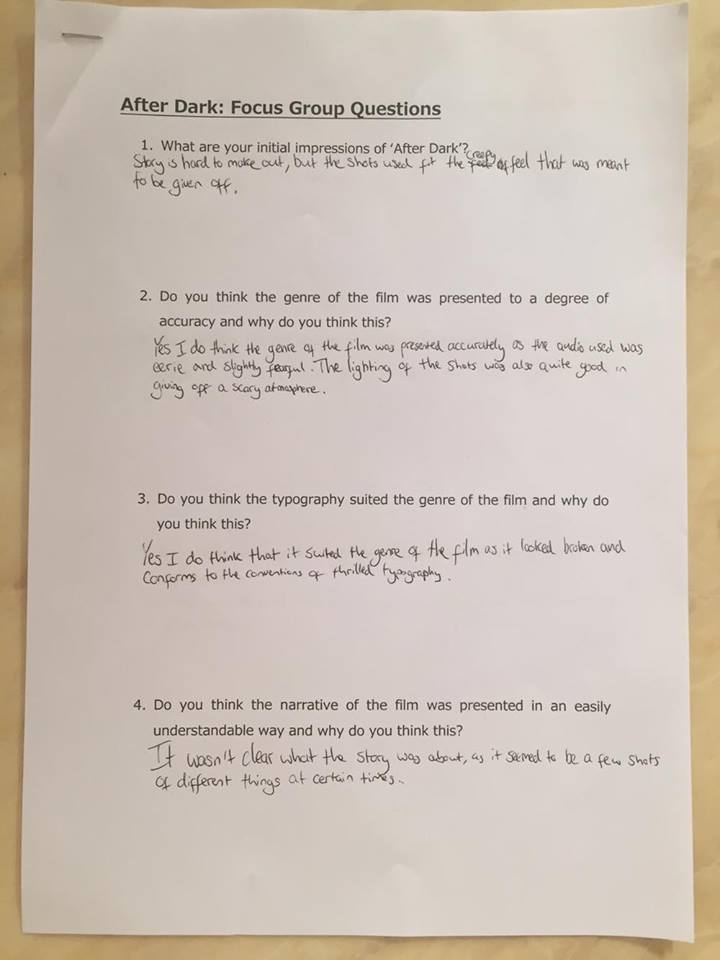
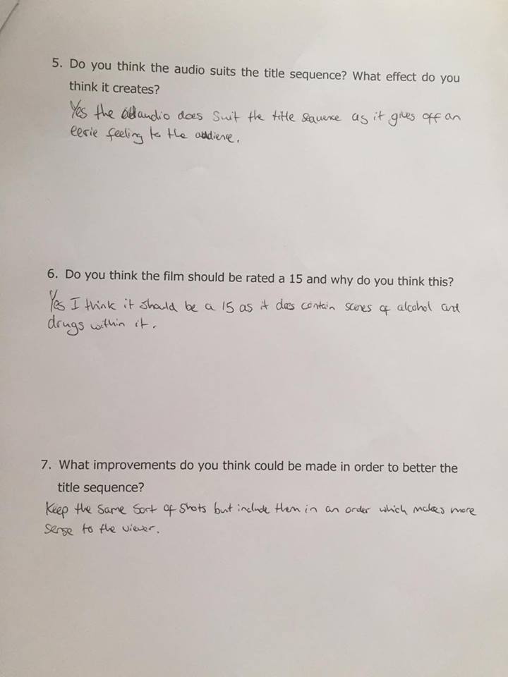
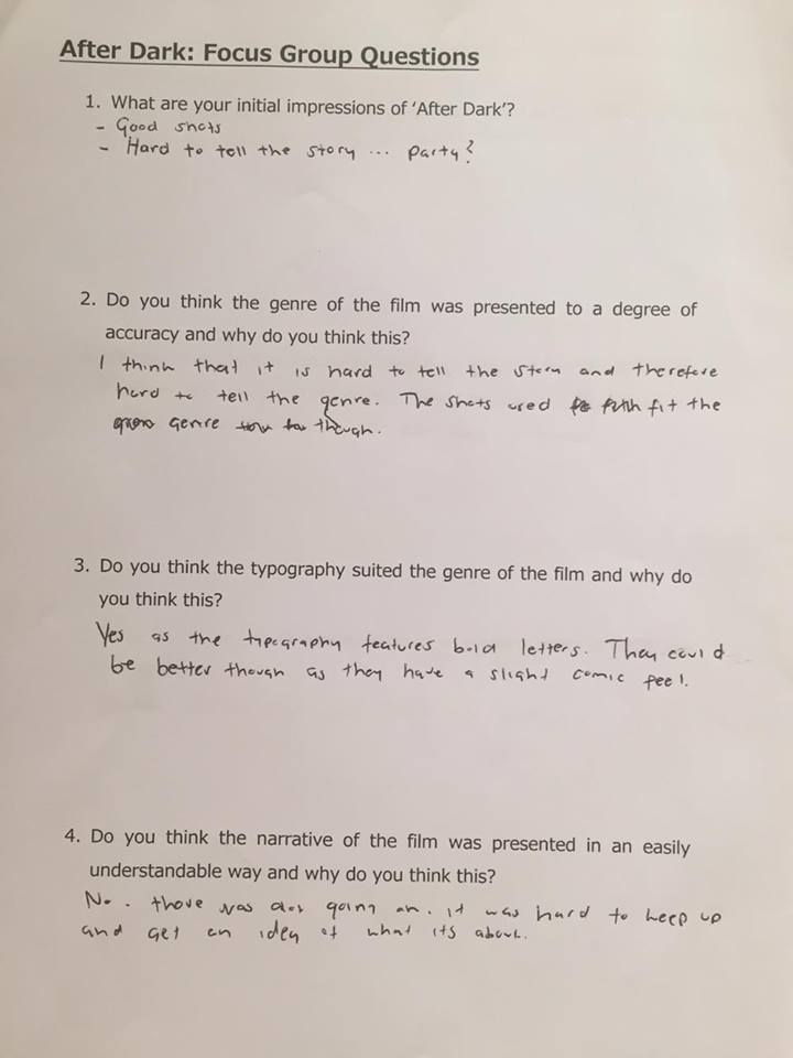
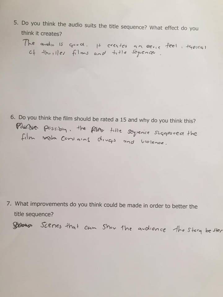
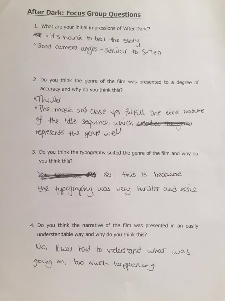
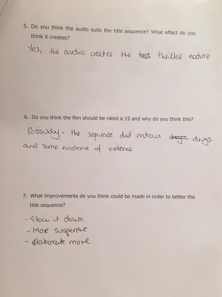
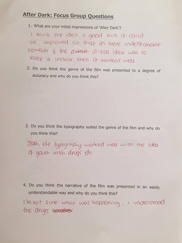
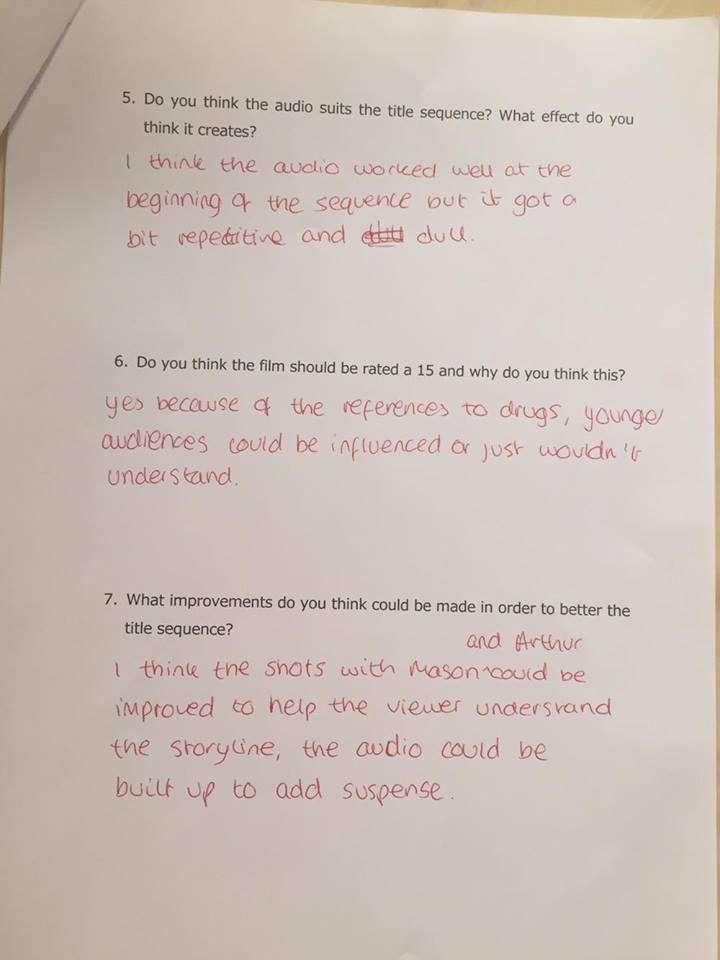
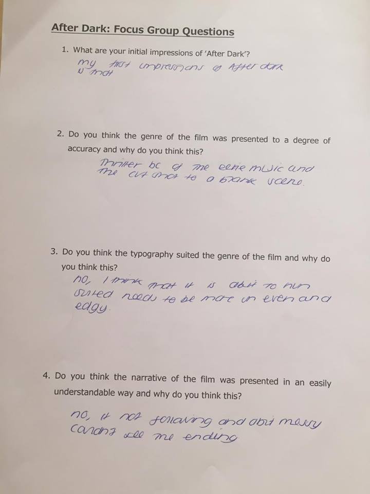
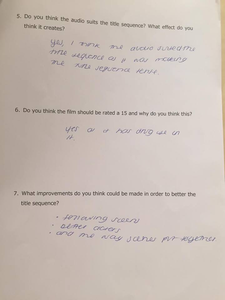
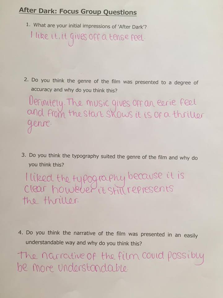
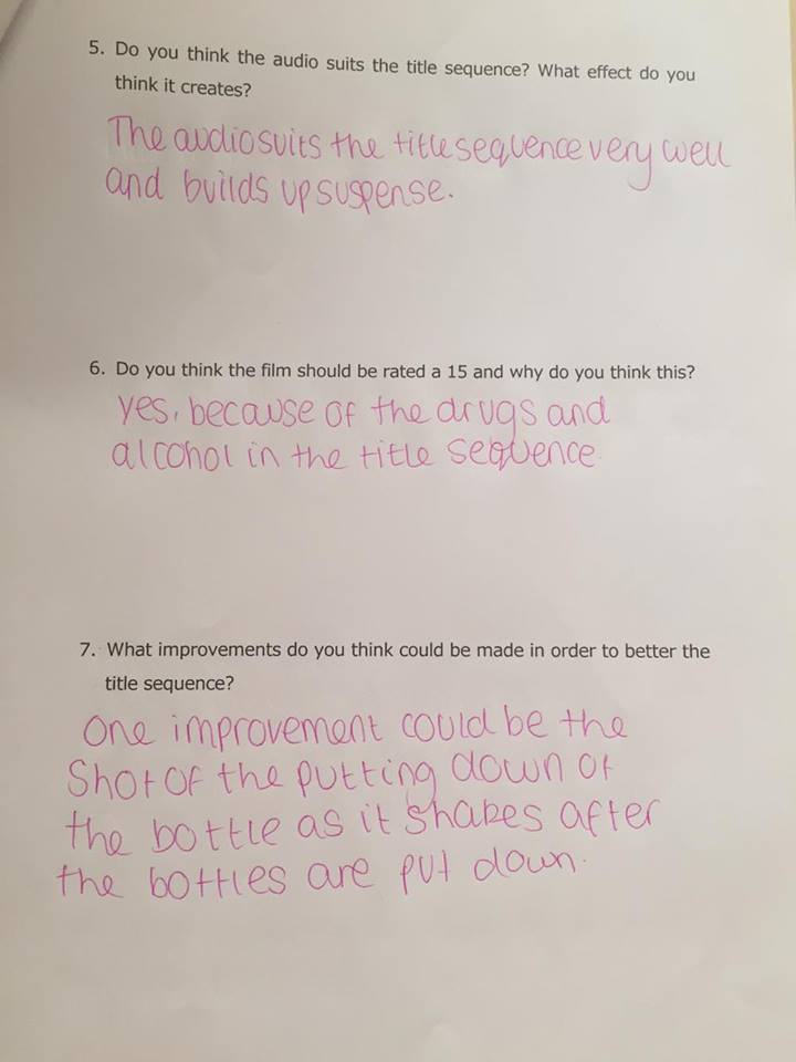
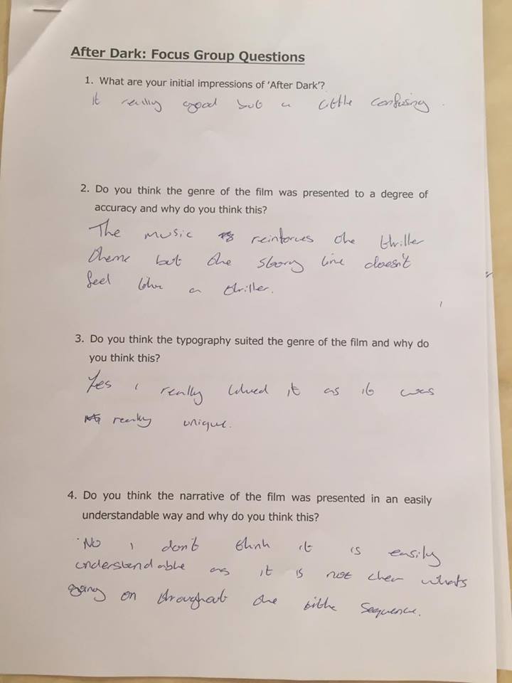
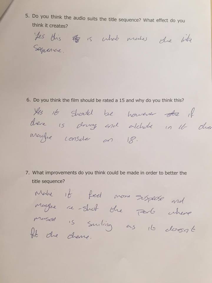

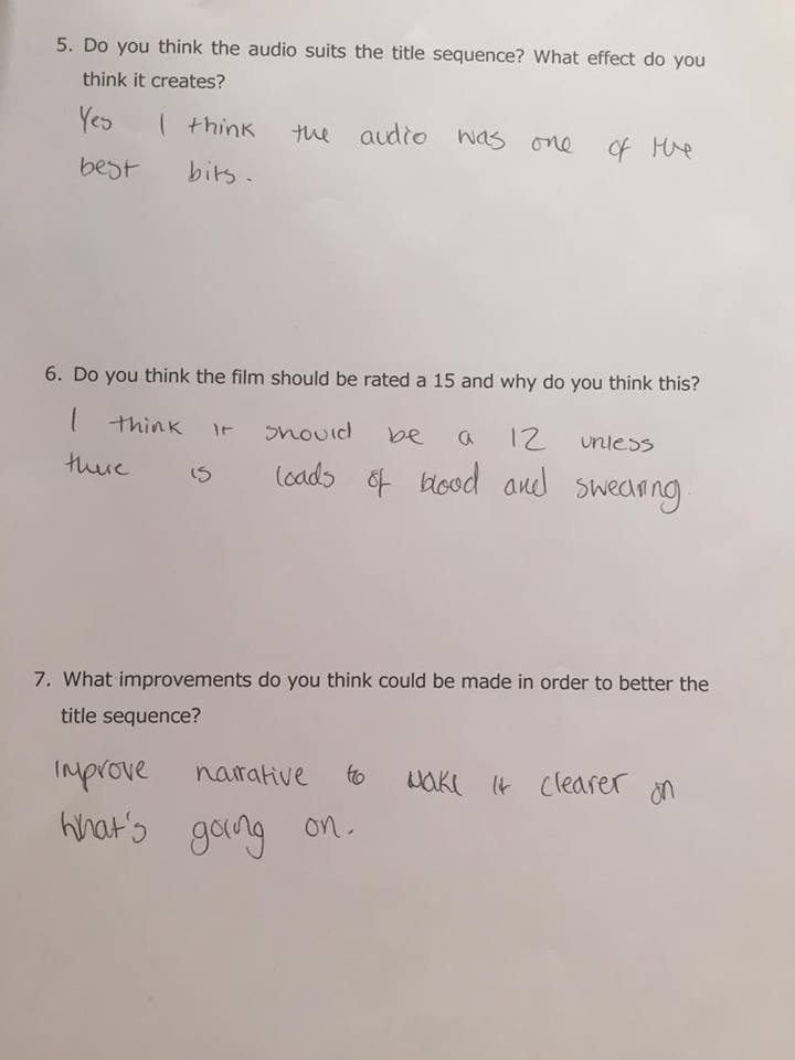
Our director of photography Chloe has created a series of questions for the audience to answer to gain feedback about our title sequence. We can use this feedback to help us improve our title sequence and meet the demands of the consumer. The questions Chloe has designed are aimed to get information/feedback about our weak points of our media product, thus meaning we will be able to review these answers to improve our weak points to potentially make our media product stronger overall.
Monday, 4 April 2016
Second Draft of our Main Task
We have incorporated many changes to our title sequence to create our second draft. I managed to change the font to Baron Kuffner to give a more chilling tone to our titles rather than just plain titles. I have researched and found that this font is the best suited to our chosen genre. We have cut out our scenes with Arthur and Aashna at the end of our first draft as our feedback implied that the audience was very confused by the scene and didn't understand what was going on and what the scenes meant. We also felt as a group that the final scenes dragged the title sequence on slightly and that when re-watching it our title sequence come across more like a trailer than a title sequence for a movie. By cutting these scenes out we have been able to build even more suspense for the audience as they don't find out what happens to the characters in the title sequence and await their fate, meaning that our title sequence now follows more thriller genre conventions in our second draft as it builds suspense for the audience and the audience are awaiting the characters fait,.
Thursday, 17 March 2016
Age Rating Certificates
U- The "U" stands for universal. A film rated U is suitable for all audiences aged four years and over. This means a film with the "U" age rating will not explore any bad language or sexual content. These sort of films are aimed towards children and families.
PG- The "PG" certificate stands for parental guidance, meanin that the film is for general viewing, but some scenes in the film may be unsuitable for children of a young age. It is advised that Pg films should be viewed by kids of age 8 older as the scenes would not unsettle them at that age but may upset that of a younger audience.

12A and 12- These ratings mean that the video content shouldnt be viewed by children younger than 12 as the content isn't suitable for people younger than that age. 12A means that a 12 year old can see the film in the cinema with the regards of being accomponied by an adult. Some may ask what is the diference between 12 and 12A and the only difference is that a 12 year old can only view a 12A rated film within the company of an adult.
15- This certificate means no-one under the age of 15 can view the film as it is not suitable for any one under the age of 15 even if they are accomponied by an adult.
18- Films rated 18 means that they are for the adult audience and are most likely to axplore bad language, sexual scenes and possible drug use and violence. No one under the age of 18 is allowed to view an 18 rated film.

R18- R18 is a legally restricted category. Films that involve explicit works and strong sexual and fetish material involving adults. Films with this rating may only be viewed in specially liscened cinemas and only be supplied to adults only in liscenced sex shops.
Our main task would fall into the 15/18 rating as it is aimed at the teenage audience but involves drug and alcohol use.
Wednesday, 16 March 2016
Improvements Of Title Sequence
I found this tutorial on youtube on how to increase the qaulity of our shots in premiere pro. This will help us achieve our maximum quality and potential out of our shots to give a sharp and professional finish.
Friday, 11 March 2016
Skills Audit
This skills audit is for recording and seeing the developments and improvements of my media skills throughout the course. It allows me to identify and adapt my weaknesses to help improve my skills in the course.
Monday, 22 February 2016
First Draft Of Our Main Task
This is our first draft of our title sequence for our main task. I think it is a pretty strong first draft with a lot of strengths and a few weaknesses. The weaknesses of our main task I think personally is the typography of our titles. I think I should edit them and use the Barron Kuffner font from Dafont.
Tuesday, 16 February 2016
Order of Titles
An improvement from our first draft is to correct our order of titles. We did not take this into account whilst making and editing our title sequence.
The order of opening credits are as follows:
The order of opening credits are as follows:
1. Name of the studio that is distributing the film.
2. Name of the production company responsible for making the film. If an investor financed a substantial portion of the movie, they will usually be credited alongside the production company with “In Association with.”
3. A (Producer’s Name) Production.
4. A Film by (Director’s Name).
5. Starring (this is optional or can be paired with the first cast member’s name), followed by the names of all principal actors.
6. Film title.
7. Featured cast members. A card that states “Featuring” used to be fairly commonplace but now appears to be falling out of fashion; in some cases, to speed up a title sequence, featured players are held off for the end crawl.
8. Casting by.
9. Music, composer, or original score.
10. Production designer.
11. At this point it can vary; you might see makeup, costume, or visual effects credits here or skip to the next few credits. At this point it should vary based on what is most important to the movie. If the movie’s a high budget sci-fi bonanza, it’s appropriate to credit the VFX team or supervising visual effects artist here; if it’s an historical epic, costume and makeup should probably get some notice here.
We will not have to include all of these roles in the making of our film such as a VFX team.
Wednesday, 10 February 2016
Why did the X-Files use the same title sequence?
The hit 90's TV series has recently made a comeback to our screens since the 9/11 conspiracies.The original title sequence being used brings up a lot of nostalgia for the old X-File fans that previously watched the show. The theme tune is very iconic and reinforces this nostalgia to bring up old excitement for fans. The old title sequence may of been used to depict the change in the re-make of the show. By comparing the old title sequence with the new roles draws people away from the idea that they are similar to the old X-Files as they have been compared. The importance of this title sequence is to bring out all the nostalgia and excitement of the X-Files to the old fans and bring them back to watch it.
Slowing down the speed of shots
To add tension to our main task title sequence I wanted to slow down some of the shots that we filmed form their normal speed to create an eerie atmosphere between the black out cuts.
I changed the speed down in percentages to get the perfect speed for each shot to get the correct duration. This tutorial has been beneficial as it has added to my editing skill set as I have the technical ability to slow down the speed and duration of shots in adobe premiere in a number of different ways to display different outcomes
I changed the speed down in percentages to get the perfect speed for each shot to get the correct duration. This tutorial has been beneficial as it has added to my editing skill set as I have the technical ability to slow down the speed and duration of shots in adobe premiere in a number of different ways to display different outcomes
Monday, 8 February 2016
Title sequence analysis summary
From analysing the title sequences , I have learnt that a common convention of title sequences are blackout screens with the typography on top. I have learnt that this draws the audience towards the typography and titles a lot more compared to titles on top of a footage background. The biggest shock for me was how simple the typography used was and that they are still very affective even though they are very simple and basic. I think my biggest inspiration is the tile sequence to ill Manors as the aspiring speech and moving titles ties in superbly with the blackout cuts. I have also learnt that the title sequence can imply and hint things about the rest of the film. I have also learnt that synchronous sound is very effective in building tension especially if the music has a relation tot he theme of the movie. I will especially take this into account when editing my title sequence and add music that has significance to our theme and idea.
Film Reviews
From analysing thriller films I have learnt that tension is a crucial part and convention of a thriller. keeping the audience on the edge of their seat. This is something we are going to have to recreate but using our own ideas and twists. Also, relatable instances and situations I personally feel are far more exciting and nerve wracking as you can put yourself in the situation. This has been replicated through Kidulthood and ill manors. I personally would like to recreate this feeling in my main task and take a similar approach to what kidulthood and ill manors have taken.
Django Unchained Title Sequence Analysis
The opening credits for Django Unchained features a stationary mid shot of a rocky desert. This is followed by a western country folk guitar slowly picking a riff. This non-diegetic sound creates a loose country atmosphere. This ties in nicely with the setting as the movie is based in the Wild West.
The blocky red typography resembles that of a western saloon bar. This reinforces the setting of the movie which is the Wild West (19th century America).
These titles proceed to continue to show on the still shot background.
The still shot then pans down into a group of black slaves before screening the main title.
By the camera panning down into a medium shot of the group of slaves, reveals the back of the main character as the group struggles forward revealing his brutal whipping scars. This straight away reveals the sheer brutality that slaves were put through at the beginning of the film to set the tone and level of violence yet to come in the film.
The rest of the title sequence features a series of shots of the main character Django.
These shots depict the facial expressions of Django and exploit his emotions and hardship of the character towards the way he is being treated. The fade in and out technique seen above create the effect of Django blurring in and out of reality because of how brutal he is being treated and that he is de-humanised.
Friday, 5 February 2016
Second Filming Analysis
Our second filming was very succsessful and got a lot of shots filmed. Our planning before hand with our storyboard and animatic was very useful and worth it as it increased our efficiency as a group and got more shots filmed in a shorter amount of time.
Main Task Title Sequence Story Board
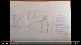
This is the story board for our main task title sequence. I can personally say that it is very well designed and laid out. This is going to make it easier and quicker to film the shots for our title sequence. This story board increases the efficiency of our group and is going to be constantly used for reference.
Subscribe to:
Comments (Atom)


